LOADING
1919–1933
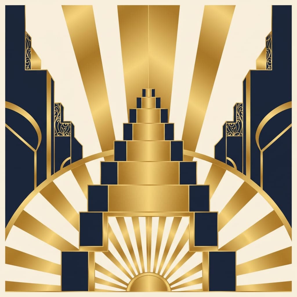
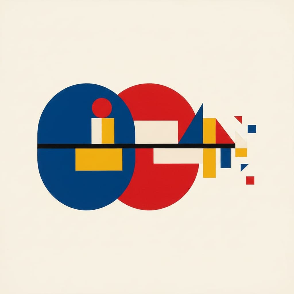
Bauhaus Geometric
Primary colors, clean geometry, and the conviction that form follows function. The Bauhaus stripped art to its structural bones and found beauty in the grid.
CREATE IN THIS STYLESAMPLE COMPOSITIONS
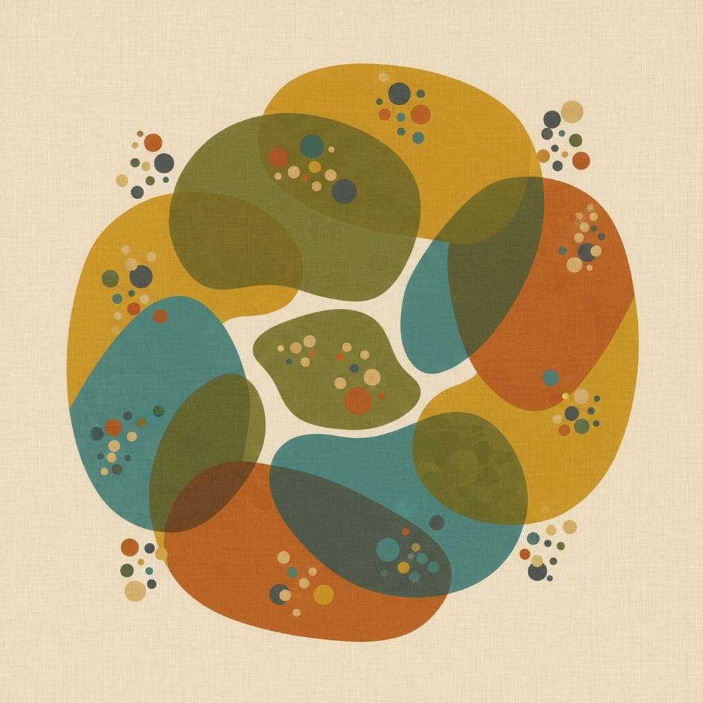
Six pieces in this style
Each piece below is ready to ship. Buy as is, or use Create variation for a tweak.


The Bauhaus opened in Weimar in 1919 with a simple radical idea: art and craft and architecture and design should be the same school. Painting and pottery should sit in the same conversation. Form and function should not fight each other. The result, in 14 short years before the Nazis shut it down, was a visual language that still defines how we think about modern design.
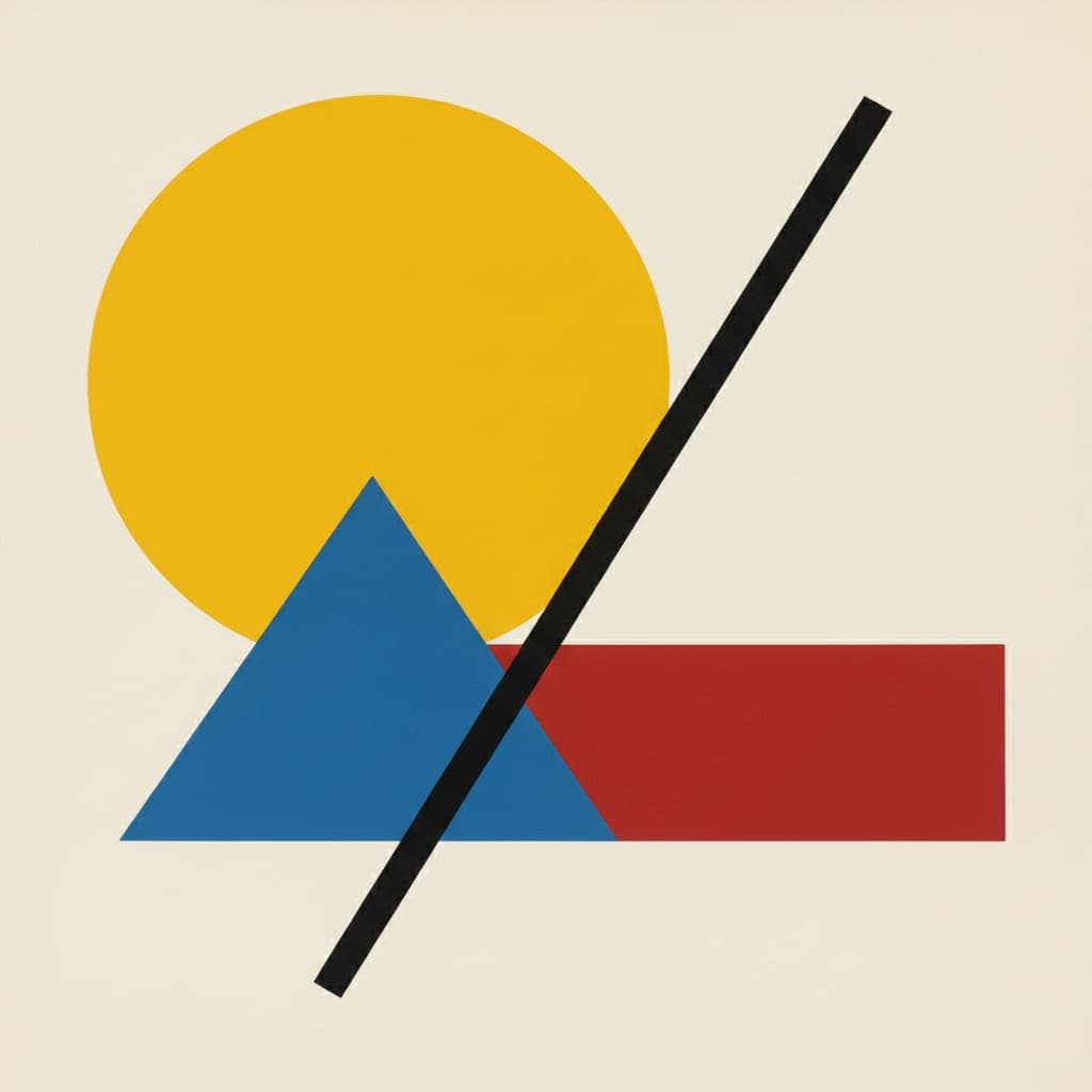
Bauhaus geometric work is built from a small alphabet. Circles, triangles, rectangles. Primary colors. Red, blue, yellow with black and white as anchors. Asymmetric balance. Sans-serif everything. The simplicity is deceptive. A good Bauhaus piece does an enormous amount of work with very few pieces, like a chess endgame where every square matters.
On a wall, Bauhaus geometric reads as confident without being loud. It does well in spaces with clean lines already. Mid-century modern interiors. White walls with darker furniture. Workspaces that need a focal point but not a distraction. The work tells you exactly what it is and then lets you get on with your day.
Our generation pipeline weights this style toward the Bauhaus visual conventions: strict geometry, primary palette, flat color fields, asymmetric balance. The result is a piece that could have hung in Dessau in 1928, generated in seconds and printed on archival paper for your wall.
SIGNATURE PALETTE
#E53935
#1E88E5
#FDD835
#212121
#FAFAFA
VISUAL VOCABULARY
When you generate in this style, our system weighs these elements to keep the result authentic:
strict geometric shapes: circles, triangles, rectanglesprimary color palette: red, blue, yellow with black and whiteflat color fields with sharp edgesasymmetric balanced compositionsans-serif typographic elementsconstructivist influenceclean minimal backgroundarchitectural precision
Ready to make your own?
Five free generations. No credit card. Tell us about your space.
START WITH BAUHAUS GEOMETRICRELATED AESTHETICS